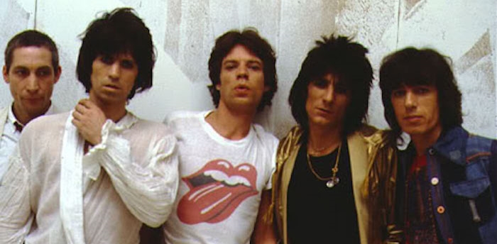
The Rolling Stones were in town recently as part of their Zip Code tour, which means I saw their famous “Tongue and Lip” logo frequently. In marketing and business, logos can be important visual identifiers, and the Rolling Stones have one that any business – as well as band – would be envious of.
A few years ago, Inc. Magazine put together four characteristics of great logo design:
- Make it Unique
- Make it Adaptable
- Make it Timeless
- Make it Appropriate (to your firm and your customer, or band and audience)
Beyond the Stones, many other bands have strong logos that meet this criteria, including the Grateful Dead, Led Zeppelin, KISS, Red Hot Chili Peppers, Van Halen, Public Enemy and Wu-Tang Clan. Oddly, in today’s landscape of ubiquitous marketing, band logos don’t seem as big.
Ultimately with a band, the music will be the thing. You will connect to it or not. And if you do, their songs will have the power to trigger an emotional response years later. Their name will elicit smiles, memories and the occasional dance move. But the most iconic logos aren’t some kind of interpretation, but rather a visual peg on which to hang the music and your feelings toward it.
Businesses can follow that lead. Rather than trying to communicate your product or service, create an identify that is unique, adaptable, timeless and appropriate. The value you deliver will bring it meaning and the logo will be the visual prompt, hopefully eliciting a positive impression, if not smiles and dance moves.
The same can be said of names. Free from trying to explain their music, bands look to other inspiration. So “The Beatles” allegedly started as a homage to Buddy Holly’s Crickets. The Doors name comes from a book by Aldous Huxley – The Doors of Perception – which in turn comes from a poem by William Blake. Nashville’s own Kings of Leon is named after the band’s grandfather.
Business names can be inspired by a variety of sources as well, without being too literal or trying too hard to be cute. That said, be careful. It’s hard to connect with a random collection of letters with no meaning or reference point.
Google is a great example. It’s a play on “googol” a mathematical term, which they have assigned meaning to it by the value they deliver. The logo itself is unique, adaptable, timeless and appropriate. And they’ve built a visual identify off of it, so as they roll out new products, updates and user interfaces, the design and color scheme holds it all together.
What companies do you think have strong logos that represent their brand? Can you think ofA newer bands with great logos to go with these classics?
